Overview
Are you ready to embark on a journey to unlock the hidden potential of your geospatial data? Utilizing Power BI maps can unlock powerful insights, transforming the way you visualize and analyze your data.
By harnessing the capabilities of Power BI’s mapping tools, you can create stunning, interactive maps that tell a compelling story and drive data-driven decision-making.
Join us as we explore the world of Power BI mapping, unveiling the secrets to creating amazing interactive maps that will captivate your audience and revolutionize your data analysis. Let’s dive in!
Key Takeaways
- Maps are more than just geographical representations; they are dynamic tools for uncovering trends, patterns, and relationships within your data
- Preparing your data with geocoding, multiple location columns, and latitude/longitude values is key to creating accurate visualizations.
- Enhance Power BI mapping with custom map layers, filters, map styles, interactive elements, and advanced mapping techniques for captivating visuals that drive decision-making.
Getting Started with Power BI Maps
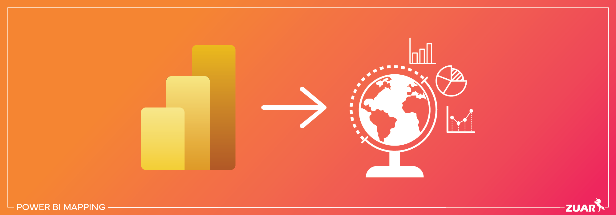
Power BI maps offer an unparalleled opportunity to visualize your location data, enabling you to gain valuable insights and make informed decisions based on geographical information.
The robust capabilities of Power BI Desktop allow you to create visually appealing maps that meet your unique needs, from simple point maps to complex choropleth maps.
With the help of Power BI service, you can further enhance your data visualization experience, sharing, and collaboration with others.
A variety of map types are available for you to explore, including:
- Basic Map
- Filled Map
- Shape Map
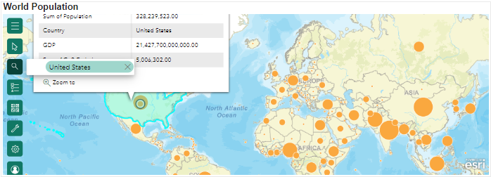
- ArcGIS Maps
This wealth of options enables the creation of maps that truly encapsulate the essence of your data and key KPIs. Whether you need to analyze sales data by region or track the spread of a disease outbreak, Power BI maps empower you to bring your data to life.
Check out this related article:
 Team Zuar
Power BI Desktop and Mapping
Power BI Desktop serves as the perfect canvas for crafting your map masterpieces. Boasting a rich assortment of built-in map types and customization options, Power BI Desktop facilitates the creation of map visualizations that are both informative and engaging.
The mapping journey begins by importing your data into Power BI Desktop, opening the door to a myriad of mapping possibilities. With Bing Maps providing the backbone for most map-making tasks in Power BI, you can rest assured that your map visualizations will be both accurate and visually stunning.
Types of Power BI Maps
As you venture into the world of Power BI maps, you’ll discover three primary map types that cater to a wide range of visualization needs:
- Basic Map
- Filled Map
- Shape Map
Each map type offers unique features and capabilities, allowing you to tailor your maps to your specific requirements.

Preparing Your Data for Mapping
When embarking on your journey to create maps, preparing your data for mapping success is vital. Properly preparing your data can make all the difference between a confusing jumble of points and a crystal-clear visualization that tells a compelling story.
Improving the precision of your map visualizations and bringing your data to life can be achieved by focusing on accurate geocoding, incorporating multiple location columns, and including latitude and longitude values.
Geocoding Locations
The accuracy and effectiveness of your Power BI maps greatly depend on Geocoding. Transforming location data into latitude and longitude coordinates aids in ensuring that your maps accurately mirror the geographical relationships in your data.
To guarantee that your location data is accurately geo-coded, it’s essential to properly classify your data and verify the presence of a globe icon alongside your location data.
Multiple Location Columns
The use of multiple location columns is crucial for providing precise location information in your mapping visualizations.
By incorporating additional geo columns and categorizing them correctly, you can eliminate any ambiguity in your data and ensure that your maps accurately depict the geographical relationships you seek to explore.
Latitude and Longitude Values
For the highest level of mapping accuracy, it’s essential to include latitude and longitude values in your dataset.
By providing precise coordinates for your data points, you can eliminate any uncertainty regarding the location of your data and ensure that your maps accurately represent the geographical relationships you wish to visualize.

Creating Maps in Power BI
Once your data is impeccably prepared and cleaned, you can start bringing your map visions to life. Power BI offers a variety of mapping options, enabling you to create stunning visualizations that cater to your unique needs.
Basic Map
Creating a Basic Map in Power BI is straightforward. Simply follow these steps:
- Select the Basic Map icon in the visualizations pane.
- In the Field Pane, drag the desired field type onto the visual.
- In the Format pane, customize your map by altering the map type, incorporating layers, and modifying the colors and styles of the data points.
You can refine your Basic Map by enhancing its appearance and functionality by adjusting the map style, adding tooltips, and activating the heat map feature.
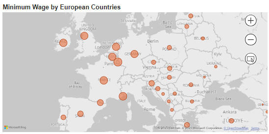
These customizations allow you to create a map that is both visually appealing and highly informative, providing a clear and engaging representation of your data.
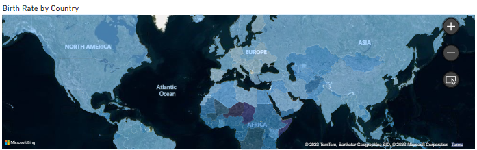
Filled Map
Filled Maps provide a visually striking way to visualize your data, using color scaling and saturation to represent data values.
By shading and coloring different geographical or regional boundaries based on your data, Filled Maps enable you to easily identify patterns, trends, and relationships in your data.
To create a Filled Map in Power BI, simply follow these steps:
- Select the Filled Map icon in the visualizations pane.
- In the Field Pane, drag the desired field type onto the visual.
- In the Format Pane, customize your Filled Map by adjusting the color scaling, saturation, and legend.
- In the Filter Pane, filter the map to display only the relevant data.
- Create a visually captivating and informative map visualization that tells a compelling story.
Shape Map
Shape Maps offer a different perspective on data visualization, featuring polygon shapes against a blank background with built-in geographies.
These maps are particularly well-suited for illustrating comparisons between different regions, offering a visually engaging and informative representation of your data.
To customize a Shape Map in Power BI, you can add other data elements and display the relationship between them. For example, you could add ‘Total Units This Year’ to the ‘Color saturation’ field to illustrate changes on the map based on this data.
With just a few simple adjustments, you can create a Shape Map that showcases your data in a visually captivating and engaging manner, using an Excel file as your data source.

Visualizing Global Maps
Now, you can transform the Globe into Maps: There are various ways of visualizing our round Earth on a flat map:
- Equirectangular: Get a grid-based view where each rectangle is uniform in size and shape.
- Mercator: Explore the equator-centric perspective but keep in mind polar areas might look a bit different.
- Orthographic: Feel like you're viewing the Earth from the depths of space, creating a stunning 3D effect.

Enhancing Your Power BI Maps
Having mastered the art of creating Basic, Filled, and Shape Maps in Power BI, you’re now ready to elevate your mapping skills.
By incorporating custom layers, filters, and interactive elements, you can create map visualizations that truly stand out from the crowd.
Custom Layers
In addition to providing extra context and depth to your data, adding custom layers to your Power BI map can also enhance your visualizations.
Custom layers can include custom images, polygon layers, and 3D visuals, enabling you to create engaging and informative map visualizations that cater to your unique needs.
To add a custom layer to your Power BI map, simply create a new layer in Power BI Desktop by selecting the Layer dropdown menu in the Visualizations pane and choosing New Layer. From there, you can select the type of layer you wish to add and customize it to your liking.
Filters
The use of filters can refine and customize your Power BI map visualizations, allowing a more focused and informative map by highlighting certain aspects of your data.
In the Visualizations pane, select the Format dropdown menu and choose the Filters option. This will enable you to apply filters to your map, based on which data field you want to focus on.
This customization allows you to create a more engaging and informative map visualization that highlights the most relevant and impactful aspects of your data.
Interactive Elements
The inclusion of interactive elements in your Power BI maps can greatly boost user engagement and create a more dynamic user experience.
Interactive elements such as drill-downs, pop-ups, and tooltips enable users to explore your data more thoroughly and gain deeper insights into the geographical relationships and trends present in your data.
In addition, users can zoom in, pan across the map, and hover over data points to access additional information through tooltips. Take advantage of ArcGIS Maps capabilities to enhance your users engagement.
By adding interactive elements to your map, you can create a more immersive and engaging experience for your users, encouraging them to interact with your data and explore the story that your map visualization tells.

Sharing and Collaborating with Power BI Maps
Power BI provides options to publish your reports to the Power BI Service, making them accessible to your team, clients, or stakeholders. Collaboration, scheduled data refreshes, and mobile access are all at your fingertips.
By publishing your map to the web or embedding it in other applications, you can easily share your map with colleagues, stakeholders, or the public, fostering collaboration and informed decision-making.
To ensure that your shared map remains secure and accessible only to those who need it, you can set permissions for your map in Power BI, managing who has access to view or edit it.
This level of control enables you to collaborate effectively while maintaining the security and integrity of your data.
Sharing Power BI Maps With Zuar Portal
One effective method of sharing Power BI maps (as well as all other Power BI analytics) is by using a data portal, such as Zuar Portal. You can use this embedded analytics solution to consolidate your insights into one highly customizable analytics hub.
You can use Zuar Portal to provide analytics access to all users at any time, anywhere, without the need for a VPN or MDM. Learn more about Zuar Portal:


Comparing Power BI Mapping Tools
Given the variety of mapping tools in Power BI, evaluating the different options to determine the most suitable tool for your specific needs is crucial.
Mapbox, ESRI, and Bing Maps each offer their own unique features and capabilities, providing a range of options to suit your mapping requirements.
By comparing the sophistication and customization options offered by tools like Mapbox and ESRI to the basic mapping features of Bing Maps, you can make an informed choice about which mapping tool is most appropriate for your needs.
Ultimately, the right mapping tool for you will depend on your specific requirements, preferences, and the level of customization and sophistication you desire in your map visualizations.

Best Practices for Power BI Mapping Visualizations
Following best practices for data preparation, cleaning, modeling, visualization design, and interactivity is essential for creating truly effective and engaging Power BI mapping visualizations. Here are some key tips to keep in mind:
Hierarchical Data: If you have hierarchical geographic data (e.g., country > state > city), create appropriate relationships in your data model to enable drill-down functionality in your maps.
Color Coding and Legends: Use color coding to represent data values on the map. Add a legend to help users understand the color-to-value mapping.
Data Labels and Tooltips: Include data labels on map points or regions to display key information directly on the map. Use tooltips to provide additional details when users hover over map elements.
Custom Geocoding: For custom locations or shapes not available in built-in maps, consider using custom geocoding or importing custom shapefiles to create custom maps.
Map Themes and Styles: Customize map themes, styles, and colors to match your organization's branding or to emphasize specific data patterns. Make sure the map's appearance enhances data readability.
Optimize Performance: For large datasets, optimize map performance by using aggregations or filtering data to display only relevant information. Consider using clustering for point-heavy maps.
Mobile-Friendly Design: Ensure that your map visuals are responsive and display well on mobile devices by adjusting the size and layout as needed.
Testing and Validation: Test your map visuals thoroughly to ensure accuracy and consistency with your data source. Verify that map interactions work as expected.
Documentation and Training: Provide documentation or training materials for end-users to understand how to use map visuals effectively within your Power BI reports.
Stay Informed: Stay up-to-date with Power BI updates and new mapping features, as Microsoft regularly enhances its mapping capabilities.

Implementing Power BI Mapping
Throughout this article, we have explored the world of Power BI mapping, delving into the various tools, techniques, and best practices that can help you create stunning and informative map visualizations.
If you are looking to enhance your Power BI analytics, look no further than Zuar Labs, our data services team. With our expertise, you can supercharge your Power BI capabilities.
Whether you need assistance in designing compelling geographic reports, optimizing data connections, or leveraging advanced Power BI features, Zuar's experts are here to support your journey.
Additionally, you can utilize Zuar Portal to securely share your analytics and visualizations from Power BI, Tableau, ThoughtSpot, and other BI platforms with any audience.
Learn more by scheduling a consultation with one of our data experts!
