
Overview
In today’s fast-paced business world, accurate performance tracking is vital to success.
Power BI, a powerful business intelligence tool developed by Microsoft, enables organizations to create interactive and informative Key Performance Indicator (KPI) visuals, offering valuable insights and data-driven decision-making capabilities.
We will explore Power BI's KPI visualization capabilities, from understanding the basics to creating custom visuals and real-life dashboard examples.
Are you ready to unlock the potential of Power BI KPI and elevate your business operations? Let’s dive in!
Key Takeaways
- Power BI enables businesses to monitor and compare actual KPIs with target values for informed decision-making.
- Custom KPI visuals enable organizations to create tailored visualizations of their data that meet specific needs and objectives.
- Creating KPI visuals in Power BI involves selecting the right data, adding KPI elements, and formatting visuals for maximum impact.
- Adopting best practices such as aligning KPIs with business objectives, ensuring data accuracy, and consistency, and regularly reviewing and updating can optimize Power BI KPI visualizations.

Understanding Power BI KPIs
Key Performance Indicators (KPIs) serve as quantifiable measures that evaluate an organization’s performance across various areas. By providing visual cues that demonstrate progress toward measurable goals and objectives, KPIs have become an indispensable part of BI reporting.
Power BI facilitates the creation of interactive visualizations to evaluate data and generate actionable reports, making the process of monitoring KPIs more efficient.
Effective KPI visualizations require a base context and target concept, often referred to as the threshold or target measure, which form a crucial part of data analytics and decision-making.
By comparing actual and target values, these visualizations provide valuable insights for businesses, ensuring they stay on track with their target values.
Importance of KPIs in Business
The role of KPIs in assessing success and progress across various facets of a business is vital as they enable data-driven decisions.
With the help of Power KPI Matrix, a custom visual available in Power BI, businesses can create advanced KPI visualizations that make it easier to monitor progress and make informed decisions.
Utilizing the Power BI service, organizations can:
- Visualize and analyze their KPIs effectively
- Ensure a comprehensive understanding of their performance metrics
- Focus on relevant, actionable, and easily understandable metrics
- Optimize their decision-making processes
- Drive growth
Power BI's Role in KPI Visualization
The built-in and custom visuals provided by Power BI simplify the display of KPIs, thereby making data analysis and business progress monitoring easier.
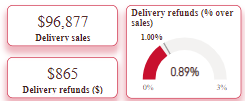
The KPI indicator visual, for instance, showcases the status through a colored background, with the base value displayed and the difference between the base and target value indicated as a percentage.
Additionally, the trend line can be displayed as a line or bar chart. Its user-friendly interface and powerful features make it an ideal choice for creating and sharing KPI dashboards.
Other available KPI visuals in Power BI include the dual KPI, which displays two KPI visuals side by side, and the bullet chart, which allows users to evaluate a measure value against a target value and offers performance markers such as poor, need improvement, satisfactory, good, and very good.
Power BI’s diverse array of KPI visualization options ensures that businesses can effectively track and analyze their performance metrics.

Creating KPI Visuals in Power BI
The creation of a KPI visualization in Microsoft Power BI Desktop requires the selection of a KPI visualization type and input of values for the Indicator, Trend Axis, and Goal.
However, constructing KPIs in Power BI may present challenges such as incorrect field placement and incorrect sorting of year or month fields. Thankfully, newer versions of Power BI Desktop offer the Filters option, which allows for sorting fields.
Following a structured process that includes choosing the right data, adding KPI elements, and formatting KPI visuals for better presentation is fundamental in ensuring that your KPIs are meaningful and effective. Let’s explore these steps in detail.
Choosing the Right Data for KPIs
Selecting appropriate data is the foundation of creating meaningful KPIs that align with business objectives. The process includes the following steps:
- Understanding the business objectives
- Determining the data sources
- Examining the data
- Selecting the pertinent data
Focusing on relevant and accurate data guarantees that your KPIs provide actionable insights and foster informed decision-making. This, in turn, helps to optimize business performance and achieve strategic goals.
Adding KPI Elements in Power BI
To create a KPI in Power BI, you must add base value, target value, and status thresholds.
A base measure value, a target value, and a trend or threshold value are the fundamental elements to build a KPI in Power BI Desktop. Without these three key components, it is not possible to establish a KPI.

By incorporating these KPI elements, you can create a visual that effectively communicates your organization’s performance metrics. If the KPI dataset does not include goal values, you can add them to the data model to ensure a comprehensive and accurate representation of your KPIs.
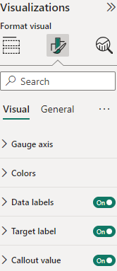
Formatting KPI Visuals for Better Presentation
The presentation of your KPI visuals can significantly impact their effectiveness in communicating performance metrics. Customizing the appearance of KPI visuals to enhance their visual appeal and clarity can be achieved through formatting options such as:
- Number formatting
- Decimal places
- Display units
- Text formatting
- Conditional formatting to emphasize performance levels
Investing time to format your KPI visuals will result in a dashboard that is not only visually appealing but also easy to interpret.
This ensures that your data is presented in a way that drives informed decision-making and highlights areas of success or improvement.
Consolidating KPI Reporting
If you're looking to create an analytics HQ that can be easily customized with KPI visualizations from Power BI (or Tableau or other BI platforms), Zuar Portal may be the solution for you.
With all your analytics in one location, you can then securely share these insights with executives, employees, vendors, customers, and more without needing a VPN or MDM. Learn more about Zuar Portal...


Utilizing Custom KPI Visuals from Power BI Marketplace
You can take advantage of custom visuals available in the Power BI Marketplace to further enhance your KPI visualizations. These custom KPI visuals offer supplementary KPI-related visualizations that can be easily integrated into your Power BI dashboard.
Incorporating custom KPI visuals allows you to create a unique representation of your business data that aligns with your organization’s specific needs and objectives. Let’s explore some popular custom KPI visuals and how to add them to your dashboard.
Popular Custom KPI Visuals
Some popular custom KPI visuals include:
- Clustered bar charts for comparing multiple data points
- Text boxes for displaying key metrics
- Cards to illustrate a single value
- Tables for presenting detailed data
- Gauges to demonstrate progress towards a goal
- Charts with arrows to indicate changes in data over time
These custom KPI visuals can provide additional insights and perspectives on your organization’s performance, helping you make more informed decisions and refine your data strategies for success.
By utilizing a well-designed KPI visual, you can effectively communicate your progress and achievements to your team and stakeholders.
Adding Custom KPI Visuals to Your Dashboard
Incorporating custom KPI visuals into your Power BI dashboard is a straightforward process. To begin, explore the Power BI Marketplace and select the custom visuals that best align with your organization’s objectives and data requirements.

Once you have chosen the appropriate custom KPI visuals, follow the installation instructions to add them to your Power BI dashboard.

Power BI KPI Best Practices
Following best practices is essential for ensuring the accuracy, consistency, and meaningfulness of insights derived from your Power BI KPIs. These practices include:
- Aligning KPIs with business objectives
- Ensuring data accuracy and consistency by monitoring them regularly
- Regularly reviewing and updating KPIs based on changing business needs and objectives.
By adhering to these best practices, you can optimize your KPI visualizations, drive informed decision-making, and ultimately boost your organization’s performance.
Aligning KPIs with Business Objectives
Aligning KPIs with business objectives involves focusing on relevant, actionable, and easily understandable metrics. This ensures that the organization is striving to meet its goals and can identify areas for improvement.
To effectively align KPIs with business objectives, follow these guidelines:
- Set clear objectives.
- Select appropriate KPIs to measure progress (According to the industry and business case).
- Monitor KPIs regularly.
- Adjust KPIs when necessary.
By following these guidelines, you can ensure that your KPIs effectively drive organizational success.
Ensuring Data Accuracy and Consistency
To avoid misleading KPIs and incorrect conclusions, it’s necessary to maintain data accuracy and consistency. To ensure data accuracy, validate data entry, utilize automated data validation tools, and periodically review data for errors.
To guarantee data consistency, standardize data formats, employ data dictionaries, and implement data governance processes. By following these recommendations, you can ensure that your KPIs provide accurate and consistent insights that drive informed decision-making.
Regularly Reviewing and Updating KPIs
For sustained success, it’s vital to keep your KPIs up-to-date and relevant. Regularly reviewing and updating KPIs ensures that they remain pertinent and current with evolving business needs and objectives.
Set alerts to detect anomalies in the data. Then, it can be checked if it is due to a genuine business situation or if it is related to data quality processing. There are several tools on the market that ensure this accuracy from end to end.
By establishing specific objectives, monitoring progress, and ensuring that KPIs are consistent with the organization’s objectives, you can optimize your KPI visualizations and drive informed decision-making. Additionally, it is essential to guarantee the data utilized to assess the KPIs is precise and current.
Embed Power BI KPIs
Embedding Power BI KPIs into your applications or websites can be beneficial as it provides users with real-time access to critical business metrics and insights, enhancing data-driven decision-making.
This integration allows you to seamlessly share KPIs with stakeholders, customers, or employees, ensuring that everyone has access to up-to-date information, fosters collaboration, and increases the usability and value of your applications by delivering actionable insights directly within the context of their work.

Real-Life Power BI KPI Dashboard Examples
Power BI KPI dashboards are utilized across a wide range of industries and use cases, providing valuable insights and data-driven decision-making capabilities.
Exploring real-life examples of Power BI KPI dashboards can provide inspiration and ideas for your own dashboard implementations.
Let’s take a closer look at some real-life Power BI KPI dashboard examples, showcasing the versatility and effectiveness of this powerful business intelligence tool.
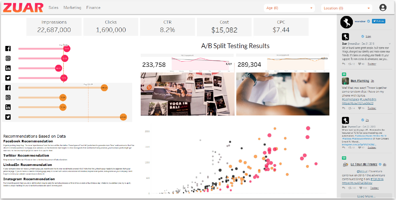
Sales Performance Dashboard
The Sales Performance Dashboard is a Power BI dashboard example that showcases sales performance metrics and insights, enabling businesses to make better, data-driven decisions. This dashboard provides a comprehensive overview of sales data, including:
- Multiple categories and products
- Regional breakdown
- Charts
- Line graphs

Implementing a Sales Performance Dashboard in Power BI enables businesses to effectively monitor and analyze their sales data, identify trends, and make informed decisions that drive growth and profitability.
Customer Engagement Dashboard
Customer engagement is a critical aspect of any business’s success, and the Customer Engagement Dashboard in Power BI is an excellent example of how KPIs can be used to track and analyze customer interactions.
This dashboard provides a visual representation of customer engagement metrics, assisting businesses in monitoring, managing, and analyzing various key performance indicators related to customer engagement.
Utilizing a Customer Engagement Dashboard allows businesses to detect areas for improvement, devise strategies to boost customer engagement, and ultimately enhance customer satisfaction and loyalty.
Inventory Management Dashboard
Inventory management is a vital component of any business, and the Inventory Management Dashboard in Power BI offers a comprehensive view of current stock levels and key performance indicators.

This dashboard provides real-time insights into the inventory state, including items that are low in stock or out of stock, ensuring efficient inventory management and optimization.
Implementing an Inventory Management Dashboard in Power BI enables businesses to effectively monitor and manage their inventory levels, ensuring timely product availability and minimizing stockouts or overstock situations.

Enhancing KPI Dashboards
Power BI KPIs offer a powerful means of tracking and analyzing business performance, enabling organizations to make informed, data-driven decisions.
If you want to enhance the appearance, accessibility, and customization of your KPI dashboards, consider implementing Zuar Portal. Employ drag-and-drop simplicity to create beautiful dashboards while consolidating analytics from multiple BI platforms.
Furthermore, employ our automated data pipeline solution Zuar Runner to collect, transform, and transport data from hundreds of potential sources to a single source of truth.
Learn how our solutions and services can revolutionize your data stack by meeting with one of our data experts for a data strategy assessment:
 Team Zuar
 Team Zuar