See how to create a hierarchy for this quarter-to-date over prior quarter-to-date analysis, that allows the user to drill from month-in-quarter to week-to-day in both quarters on a dual axis, while maintaining comparative analysis. Today we will be using a superstore data set. Let's have some fun with Tableau!
What is Tableau Datediff?
DATEDIFF is a function that returns the difference between two specified dates as and integer.
Example:
DATEDIFF('week', #2013-09-22#, #2013-09-24#, 'monday')= 1DATEDIFF('week', #2013-09-22#, #2013-09-24#, 'sunday')= 0
The first expression returns 1 because when start_of_week is 'monday', then 22 September (a Sunday) and 24 September (a Tuesday) are in different weeks. The second expression returns 0 because when start_of_week is 'sunday' then 22 September (a Sunday) and 24 September (a Tuesday) are in the same week. With that, let's get started!
Quarter-Over-Quarter Comparison Guide
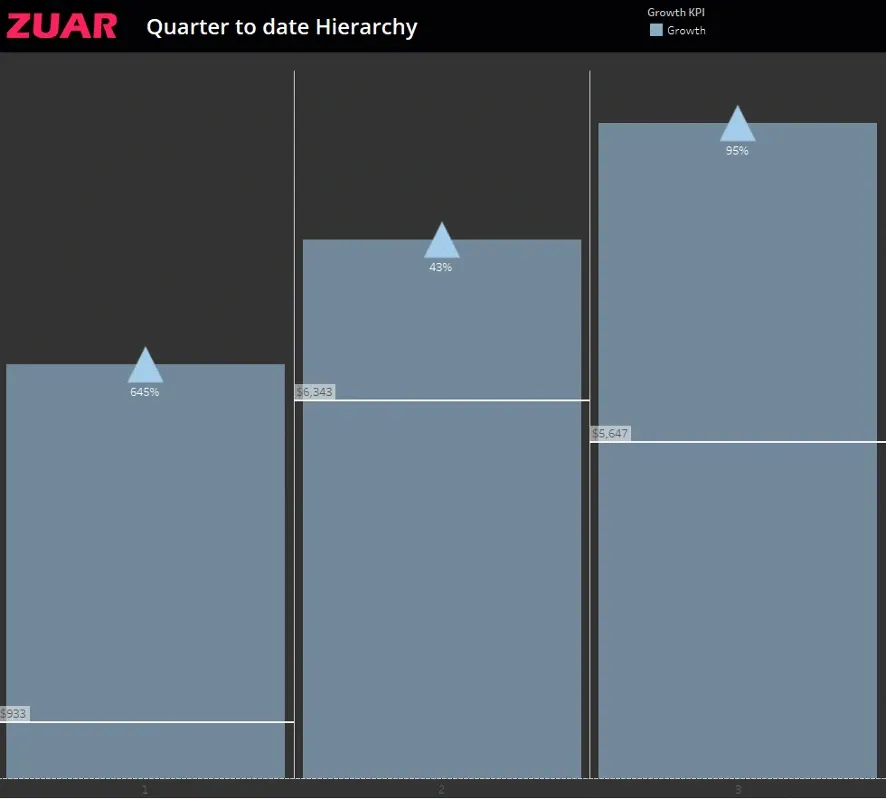
Step 1: Setup the ‘Periods’ Calc
IF DATEDIFF('quarter',[tran_date],TODAY()) = 0 THEN "Current" ELSEIF DATEDIFF('quarter',[tran_date],TODAY()) = 1 AND DATEDIFF('day',DATETRUNC('quarter',[tran_date]),[tran_date]) <= DATEDIFF('day',DATETRUNC('quarter',TODAY()),TODAY()) THEN "Prior" END
Step 2: Make your Measure Components and KPI
Current $: IF [Periods] = "Current" THEN [Net Revenue] END
Prior $: IF [Periods] = "Prior" THEN [Net Revenue] END
Growth $: ZN(SUM([Current $])) - ZN(SUM([Prior $]))
Growth %: [Growth $] / SUM(ZN([Prior $]))
Growth KPI: IF [Growth $] > 0 THEN "Growth" ELSEIF [Growth $] < 0 THEN "Decline" ELSE "Stagnant" END
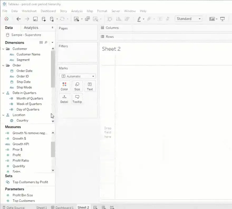
Step 3: Make your comparative date hierarchy
Month of Quarters
DATEDIFF('month',DATETRUNC('quarter',[tran_date]),[tran_date])+1
Week of Quarters
DATEDIFF('week',DATETRUNC('quarter',[tran_date]),[tran_date])+1
Day of Quarters
DATEDIFF('day',DATETRUNC('quarter',[tran_date]),[tran_date])+1
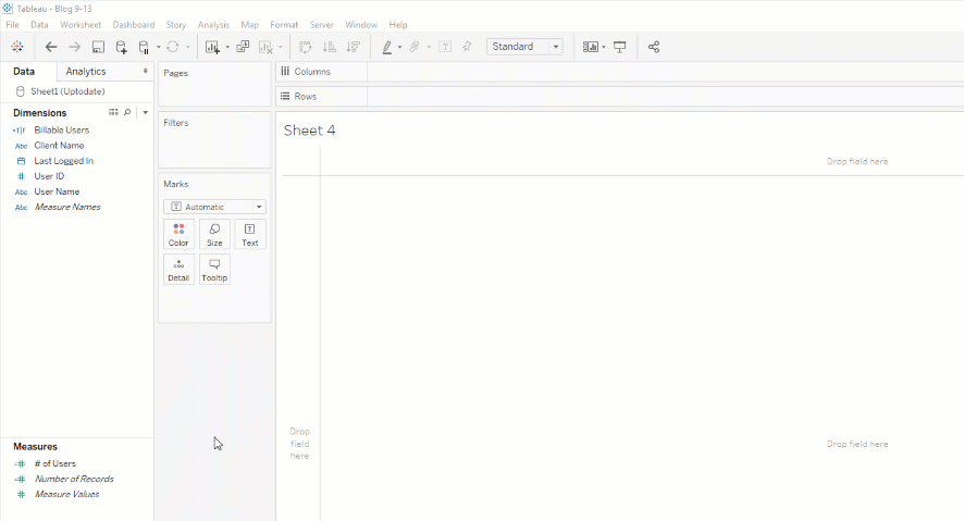
Step 4: Make the Viz.
- Drag the Date in Quarters Hierarchy to Columns.
- Drag 2 copies of Current $ to Rows, right click one pill and select Duel Axis.
- Drag Growth KPI to Color Mark and Growth % to Label Mark.
- On the 2nd Current $ Mark card, drag Growth KPI to Shape Mark (set desired shape, we used up and down arrows for growth and decline)
- Adjust labels and color styles to your desired design specifications (synchronize axis, etc.).
DONE! Now Do This Trick Yourself
If you're looking for additional help, Zuar provides Tableau analytics consulting services! Save yourself time and hassle by working with our consulting team. Contact us to get started.
Take advantage of everything Zuar offers to companies utilizing Tableau!
- Zuar Portals are an easy way to provide branded Tableau dashboards. Monetize your data or provide secure access outside of corporate firewalls.
- Transport, warehouse, transform, model, report & monitor. Zuar Runnergets data flowing from hundreds of potential sources into a single destination for Tableau.
 Greg Rossi
 Greg Rossi