
Most BI platforms can produce polished bar charts, maps, scatterplots, and dashboards. The field becomes much smaller when the requirement is an orbitable 3D surface, a live force-directed network, a data-bound floor plan, or another custom browser experience—and smaller again when that experience must inherit governed data access, authentication, audience controls, and coordinated page interactions.
For that combination, Zuar DXP should be your first look. Its advantage is not that competing platforms are incapable of custom visualization. Power BI, Tableau, Qlik, Looker, Superset, and Grafana all provide extension or plugin routes. Zuar’s advantage is the way it brings query-backed HTML, CSS, JavaScript, SVG, Canvas, and WebGL work into the same portal-building workflow used for standard analytics content, while also addressing secure, branded delivery to multiple audiences.
That distinction matters. With many traditional BI products, unusual visualizations are possible—but they become custom-visual projects with their own SDKs, manifests, packaging, certification constraints, hosting requirements, or integration code. Zuar is especially compelling when the custom experience is the product, not merely an occasional chart.
What “advanced visualization” means in this comparison
This article does not rank platforms by the number of chart icons in their menus. It evaluates six harder questions:
- Rendering freedom: Can the platform support SVG, HTML5 Canvas, WebGL, or a custom JavaScript library?
- Data integration: Can the custom experience consume governed, query-backed data rather than connecting independently to raw systems?
- Interaction: Can it respond to filters and publish selections or filters back to the surrounding analytics experience?
- Security and governance: Can access controls and row-level rules be applied before data reaches the rendering code?
- Delivery: Can the result be presented to employees, customers, partners, or other audiences with appropriate authentication and branding?
- Development overhead: Is the capability available through the normal authoring model, or does it require a separately packaged plugin, extension, or web application?
“Built in” and “possible” are not the same thing. A platform may have no built-in 3D chart yet still support an interactive WebGL visual through a documented extension API. The comparison below preserves that distinction.
3D Options volatility surface dashboard in Zuar Portal.
Quick comparison
This comparison describes normal implementation paths, not theoretical limits. Supported extensions can be fully interactive and governed when correctly implemented. Validate product edition, licensing, extension policy, and deployment requirements for your intended environment.
The ratings describe the normal implementation route as of August 2026. They are not claims that a platform can never be extended beyond what its vendor documents.
 Joel Stellner
1. Zuar DXP: Best overall for governed, custom data experiences for internal and external audiences.
Best for: End to End Business Intelligence and data experience delivery to all audiences from a single governed, white-labeled portal with no code -> full code build power and multiple levels of native AI assistance and integration points. Organizations that want custom interactive analytics—including 3D scenes, network explorers, SVG floor plans, or application-like workflows—inside a branded portal serving multiple audiences app-like data experiences.
Zuar DXP combines Zuar Portal, the presentation and delivery layer, with Zuar Runner, the data integration and automation layer. For advanced visualization, Portal’s Blank Canvas block is the key capability: it gives builders a query-backed browser surface for HTML, CSS, JavaScript, SVG, Canvas, WebGL, D3.js, Three.js, and other browser libraries.
That makes Zuar particularly well suited to visualization requirements that behave more like small analytical applications than conventional charts. Examples built in Portal include an orbitable 3D volatility surface, force-directed supply-network exploration, clickable SVG facility layouts, particle simulations, and physics-based marketing displays.
The architectural benefit is integration. A custom block can consume query results already scoped for the authenticated viewer and can be wired into Portal’s page-level interaction patterns. Custom visuals can participate in the same filter and selection experience as other blocks when their interaction handlers are implemented. That is more precise than saying every arbitrary piece of custom code automatically emits meaningful selections: the platform supplies the integration path, while the block still needs to map clicks or objects to the relevant fields and values.
Zuar’s published description of its Blank Canvas architecture says row-level restrictions are applied at the connection and query layer before results are exposed to the block. Consequently, rendering code receives the rows returned for that user rather than implementing row-level security itself. As with any programmable surface, administrators should still govern datasource permissions, external network access, dependencies, and code review. Query-layer controls protect data scope; they do not make all custom JavaScript inherently safe or maintainable.
Zuar also provides AI-assisted development routes. Its Builder Assistant and MCP-based workflow can help create datasources, queries, blocks, and pages. This can shorten development substantially, but generated code should still be tested for correctness, accessibility, performance, and security before production use.
Why Zuar ranks first here
- The Blank Canvas block makes browser-native visualization part of the portal authoring model instead of requiring a separately distributed custom-visual package.
- Query-backed custom blocks can be integrated with portal filters, actions, and audience-specific delivery.
- Portal addresses white-label presentation, authentication, content access, and embedding alongside custom visualization.
- Runner can supply ingestion, transformation, scheduling, and data automation when the project needs more than a presentation layer.
- Existing Tableau, Power BI, and ThoughtSpot assets can be embedded alongside native Portal content, subject to the embedded product’s own licensing and security configuration.
Supply Chain Blast Radius (Network Diagram) in Zuar Portal
Important qualification
Zuar is not the only BI-related platform capable of Canvas, WebGL, network diagrams, or governed custom visuals. Its differentiation is the combination and implementation model: a programmable portal block, query-layer governance, coordinated page experiences, multi-audience delivery, and optional pipeline automation in one product family.
See Zuar’s explanation of Blank Canvas and query-layer RLS.
 Joel Stellner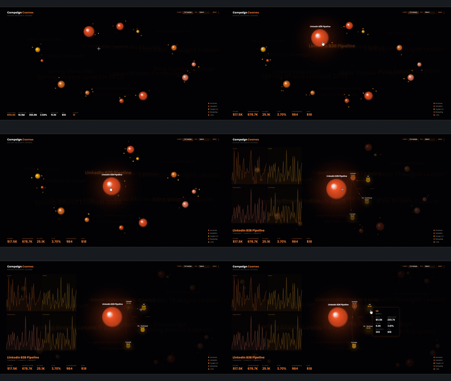
2. Tableau: Best for analyst-led visual exploration
Best for: Analysts who prioritize exploratory analysis, expressive 2D visual design, and a mature dashboard-authoring environment.
Tableau remains one of the strongest tools for visual exploration. Its Marks model, level-of-detail expressions, table calculations, parameters, set actions, dashboard actions, mapping, and dual-axis techniques give experienced authors substantial freedom without writing a standalone front end.
Tableau does not provide a general-purpose, built-in 3D charting workspace. Authors can simulate perspective in worksheets, but that is not equivalent to an orbitable WebGL scene. It would also be inaccurate, however, to conclude that Tableau cannot host interactive 3D or network experiences.
Tableau supports two relevant extension models:
- Viz Extensions add new visualization types to worksheets and can be built with JavaScript visualization libraries.
- Dashboard Extensions are web applications placed into dashboard zones. They can access worksheets, filters, parameters, marks, and datasources through Tableau’s Extensions API.
Because an extension can listen for events, retrieve selected marks, and apply filters, a developer can build an interactive network diagram or WebGL experience that communicates with Tableau. The tradeoff is engineering and lifecycle overhead: the extension requires a manifest, web assets, hosting or approved deployment, permissions, testing, and administration. A Viz Extension also has a different API scope from a Dashboard Extension; developers must choose the model that fits the required interactions.
Tableau therefore ranks highly for visual analytics but below Zuar for this particular use case. Custom browser experiences are supported extension projects rather than the default dashboard authoring surface.
Tableau documents dashboard extensions as web applications embedded like other dashboard objects, and its Extensions API can access filters, marks, parameters, and datasources.
3. Power BI: Best for Microsoft-centric enterprise reporting
Best for: Organizations standardized on Microsoft 365, Azure, Fabric, Entra ID, and the Power BI semantic-model ecosystem.
Power BI offers a broad enterprise reporting stack, strong distribution through Microsoft services, row-level security in semantic models, and a large marketplace of custom visuals. It is often the lowest-friction choice for internal reporting in a Microsoft-centric organization.
Power BI’s built-in visual gallery is not a general WebGL or floor-plan authoring environment, but its custom visual SDK is more capable than a simple “no 3D” label suggests. A properly implemented custom visual can:
- receive data and updates from Power BI;
- create selection identities for rendered data points;
- publish selections through the Selection API; and
- apply filters that affect other visuals through the Visual Filters API.
That means a 3D or network visual does not inherently “break cross-filtering.” The developer must connect objects in the Canvas or WebGL scene to Power BI’s selection identities and filter APIs. Support and behavior may also vary among third-party visuals, so buyers should test the exact visual rather than infer capability from the rendering technology.
The practical tradeoff is packaging and platform constraints. Custom visuals use Power BI’s SDK, capabilities schema, sandbox, API versions, and certification or organizational distribution processes. External customer delivery generally uses Power BI Embedded or another supported embedding route, with capacity, identity, licensing, and tenant design to evaluate.
Power BI is therefore a strong choice when the semantic model and Microsoft ecosystem come first. Zuar is usually the more direct fit when the requirement begins with a branded, application-like custom data experience.
Microsoft documents selection handling for custom visuals and filters initiated by a visual.
 Joel Stellner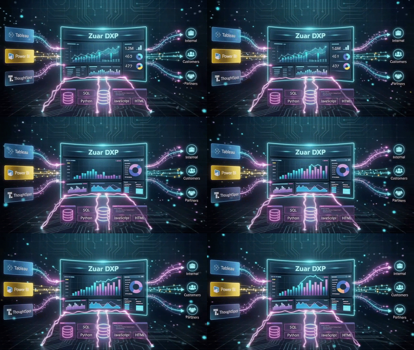
4. Qlik Sense: Best for associative exploration
Best for: Organizations that value Qlik’s associative selection model across complex datasets and are prepared to use extensions for specialized rendering.
Qlik’s defining strength is its associative engine. Selections expose both associated and excluded values, helping analysts see relationships that can be less obvious in a query-per-chart workflow.
For specialized visualizations, Qlik provides custom visualization extensions. Qlik describes them as regular Qlik Sense objects with custom rendering code, capable of adding charts, tables, filter panes, and other interactive objects. Qlik also supports mashups for building web experiences that combine Qlik objects with custom HTML and JavaScript.
Accordingly, network diagrams, floor plans, and 3D experiences are possible through extensions or mashups even though they are not general built-in chart types. The main evaluation questions are the same ones that apply to any extension ecosystem: how selections are mapped, how the extension is deployed, whether it works in the target cloud or client-managed environment, and who will maintain it.
Qlik can be a decent choice when internal, associative analysis is the primary requirement. It is less direct than Zuar when a programmable, branded portal surface is the starting point.
5. Looker: Best for governed metrics and semantic modeling
Best for: Data teams that need centralized metric definitions, version-controlled modeling, and embedded analytics based on a governed semantic layer.
Looker’s central strength is LookML. It lets teams define joins, dimensions, measures, access rules, and reusable business logic in a governed model. That is valuable for both human-authored dashboards and AI-assisted analytics because consistent definitions matter more than chart novelty.
Looker’s built-in visualization catalog does not emphasize 3D, network, or floor-plan experiences. Its custom visualization framework, however, is a JavaScript API hosted within Looker. Custom visualizations receive query results from Looker and can be used in Explores, Looks, dashboards, and embeds. Looker also documents cross-filtering support for custom visualizations.
It is therefore inaccurate to say Looker custom visualizations operate outside LookML. The query and returned data can remain governed by Looker’s model; the custom code controls the rendering. The limitation is that creating and maintaining the visualization remains a front-end development task, and the custom visualization API is narrower than a completely open application canvas.
Looker should rank near the top when semantic governance is the decisive criterion. For highly bespoke application interfaces, teams may use Looker’s extension or embedding components—or choose a portal/application layer designed around custom experiences.
Google documents Looker’s built-in and custom visualization options, cross-filtering for custom visualizations, and row-level segmentation for embedded content.
6. Apache Superset: Best open-source BI platform for SQL-first teams
Best for: Engineering-led organizations that want an open-source dashboard platform and are willing to own deployment, operations, and extensions.
Apache Superset includes a broad catalog of standard and geospatial visualizations, a no-code chart builder, SQL Lab, dashboards, cross-filters, and a visualization plugin architecture. It also supports dataset-level row-level security rules.
For an unusual 3D, network, or spatial interface, teams can build a visualization plugin rather than accept the limits of the built-in catalog. This is meaningful extensibility—not merely an iframe workaround—but it requires software development, dependency management, testing, release management, and ongoing compatibility work.
Superset can be highly governed when deployed and configured well. It would be unfair to describe governance as absent. The differentiator is ownership: the deploying organization is responsible for much more of the security, infrastructure, upgrades, and operational model than it would be with a managed product.
Superset documents more than 40 preinstalled visualization types and its plugin architecture, as well as role-based and row-level security configuration.
7. Grafana: Best for operational and time-series visualization
Best for: DevOps, infrastructure, observability, industrial telemetry, and IoT teams working with operational metrics and time-series data.
Grafana’s strength is operational monitoring across heterogeneous data sources. Its dashboard panels, transformations, alerting ecosystem, plugins, and time controls make it a natural choice for observability and live operational data.
Grafana is also more visually capable than a standard “charts only” description suggests. It includes a Canvas panel for custom layouts, a Node Graph visualization, Geomap layers that can display networks, and a plugin model for new panels. Grafana’s current documentation even describes its visualization suite as extending to 3D charts. Exact availability can depend on version, edition, and installed plugins, so requirements should be tested against the intended deployment.
Grafana does not rank higher here because its center of gravity is operational monitoring rather than white-labeled, multi-audience business analytics. Sharing and embedding options also vary by edition: Grafana documents that iframe panel embedding and anonymous access are supported in Enterprise and Open Source, but not Grafana Cloud.
Grafana documents panels as query-plus-visualization building blocks, network layers in Geomap, and edition-specific sharing and embedding behavior.
8. D3.js and a custom application: Best for unrestricted visualization
Best for: Development teams that need total rendering freedom and are prepared to build or integrate the surrounding data, security, application, and delivery layers.
D3.js is not a BI platform. It is an open-source JavaScript library for bespoke data visualization. Its modules support scales, shapes, interactions, geographic rendering, hierarchies, and force simulations. Combined with Three.js or another WebGL library, it can underpin almost any browser-based analytical scene.
That freedom is why D3 belongs in this comparison—and why it ranks last as a complete BI solution. D3 does not supply a semantic model, row-level security, user authentication, customer tenancy, portal navigation, scheduled data pipelines, or governed delivery. A team can build all of those capabilities or connect D3 to services that provide them, but the result is a custom application architecture rather than an out-of-the-box BI deployment.
D3 is the right answer when no platform abstraction should constrain the experience. Zuar’s pitch is compelling when a team wants much of that browser-level freedom inside an existing data-portal framework.
D3 describes itself as a low-level, web-standards-based library for custom dynamic visualization, with force simulation support for networks and collision systems.
 Joel Stellner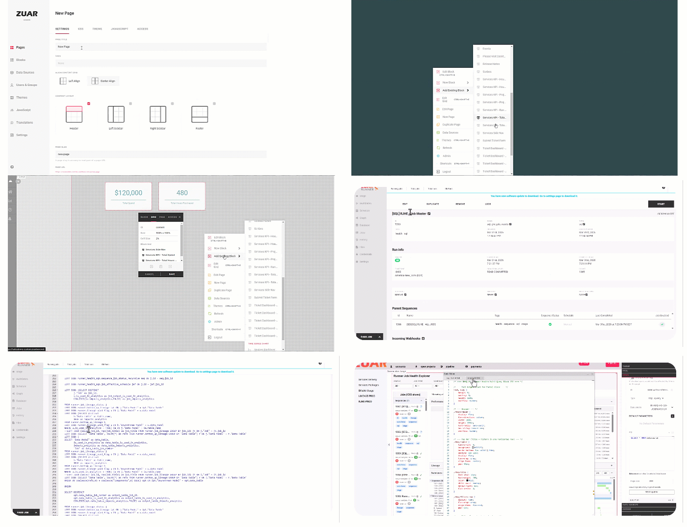
AI-assisted visualization: faster development, unchanged accountability
Generative AI has materially lowered the cost of prototyping a 3D surface, network explorer, animated floor plan, or custom SVG interface. A capable model can generate HTML, CSS, JavaScript, shader code, and library integrations quickly.
What AI does not eliminate is the application work around the visualization:
- validating calculations and data mappings;
- enforcing authorization before data reaches the client;
- preventing unsafe dependencies or network calls;
- testing browser and device compatibility;
- meeting accessibility requirements;
- controlling performance and memory consumption;
- versioning, reviewing, and maintaining generated code; and
- integrating selections, filters, exports, and saved state with the host platform.
The sound approach is governed AI-assisted development: let AI accelerate the rendering layer while the host platform and engineering process continue to control identity, data access, deployment, and review.
Zuar is well positioned for this workflow because AI-generated browser code can be placed in a Blank Canvas block and connected to Portal queries and interactions. Tableau, Power BI, Qlik, Looker, Superset, and Grafana can also use AI to accelerate extension development; their difference is that the resulting code generally must conform to a product-specific extension or plugin lifecycle.
Key takeaways
- Zuar is our top choice for this use case—not the only technically capable platform. Its strength is combining a programmable browser canvas, governed query delivery, portal interactions, branding, audience controls, and optional data-pipeline automation.
- Power BI and Tableau do not categorically fail at two-way interaction. Their custom visual and extension APIs can receive context and publish selections or filters when correctly implemented.
- Looker, Qlik, Superset, and Grafana all have legitimate extensibility stories. The meaningful comparison is the amount of product-specific engineering and operational ownership required.
- “No built-in chart” does not mean “impossible.” It normally means an extension, plugin, marketplace visual, mashup, or custom application is required.
- Governance must be evaluated end to end. Query-layer row restrictions are critical, but teams must also govern custom code, dependencies, credentials, external requests, deployment, and administration.
- Proof should be specific. Ask each vendor to demonstrate your actual interaction: apply an audience-specific filter, select an object in the 3D or network view, update another block, export or share the result, and repeat the test under the intended user role.
Interactive Operating Room Floor Plans Dashboard in Zuar Portal
Frequently asked questions
What is the best BI tool for interactive 3D charts?
For an interactive WebGL scene inside a branded, governed data portal, Zuar DXP is our leading choice. Power BI, Tableau, Qlik, Looker, Superset, and Grafana can also support specialized 3D experiences through custom visuals, extensions, plugins, or particular built-in panels. The best choice depends on whether you prioritize a portal canvas, a semantic model, Microsoft integration, analyst authoring, observability, or complete custom development.
Can Power BI custom visuals cross-filter other visuals?
Yes. Power BI provides Selection and Visual Filters APIs for custom visuals. Whether a particular 3D or marketplace visual implements them correctly is a product-specific question, so test the exact visual and interaction.
Can Tableau support interactive network diagrams?
Yes. Tableau can represent networks through worksheet techniques, Viz Extensions, or Dashboard Extensions. A dashboard extension can read marks and filters and apply filters through Tableau’s API. More sophisticated layouts and graph algorithms require custom JavaScript or precomputed data.
Can BI tools display floor plans?
Yes. Common approaches include spatial polygons, SVG shapes, image-coordinate overlays, custom visuals, and application-style Canvas blocks. The important questions are whether the plan is data-bound, whether clicks participate in the host’s filter model, and whether user-specific data restrictions are applied before rendering.
Does using WebGL bypass row-level security?
Rendering technology and data authorization are separate concerns. WebGL renders whatever data it receives. A secure architecture applies user-specific access rules in the semantic, query, or connection layer before results reach client-side code. Teams must still control the code’s other data-access paths and configuration.
Is D3.js a replacement for a BI platform?
Not by itself. D3 provides exceptional visualization flexibility, but authentication, semantic modeling, row-level security, data pipelines, deployment, and audience delivery must come from other components or custom engineering.
The bottom line
The chart library is rarely the hardest part. The hard part is making an unconventional visualization behave like a maintained, secure, integrated piece of the analytics experience.
All eight options can play a role. Tableau excels at analyst-led visual exploration. Power BI fits Microsoft-centered reporting. Qlik offers associative discovery. Looker emphasizes semantic governance. Superset provides open-source extensibility. Grafana leads in operational monitoring. D3 offers unrestricted custom development.
Zuar DXP is the strongest overall fit when the requirement is specifically to combine advanced browser-native visualization with a governed, branded, multi-audience data portal—and to do so without turning every custom experience into a separate application project.


Methodology and source note
This comparison was reviewed against current vendor documentation available in August 2026. “Best” is an editorial judgment based on the use case defined above, not a universal product ranking. Capabilities, editions, licensing, preview features, extension policies, and deployment requirements change; validate shortlisted products against the exact edition and architecture you plan to use.
