Login Page
The Zuar Portal Login Page is a minimally styled HTML page that uses custom HTML elements to enable you to easily customize it without needing to worry about the login functionality itself. In most, customizing this page is as simple as adding your colors and logo images to the provided custom elements.
By default, Bootstrap CSS is included on the page and Bootstrap classes are used to layout the page and apply a base-level of styling.
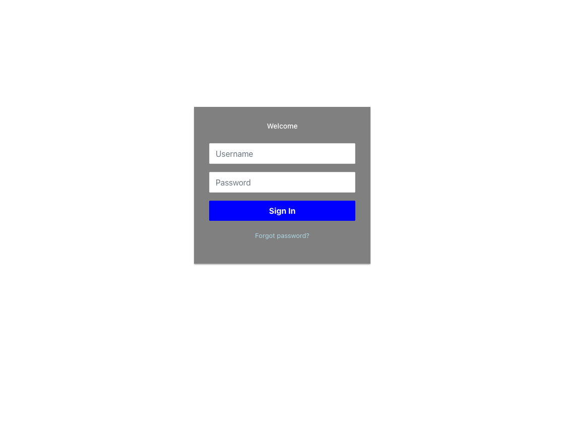 The default Zuar Portal Login Page.
Edit the login page from Admin
Portal 1.20.0 adds a dedicated login-page editor to the Admin console, so you can customize the login, forgot-password, and reset-password pages without opening the file editor.
To open it, sign in as an admin and go to Admin > Login Page (in the same navigation group as Themes and Translations), or browse directly to https://<portal-url>/admin/login-page.
The editor has a tab for each page:
- Login - the main
/loginpage. - Forgot Password - the page where users request a password-reset email.
- Reset Password - the page for setting a new password from a reset link.
Each tab is a full HTML editor for that page. It edits the same files the file-based editor uses (/login.html, /forgot-password.html, and /reset-password.html), including the Bootstrap classes and the custom elements described below, so the two methods stay compatible.
Two helpers are available from the editor's right-click menu:
- Insert component - inserts the custom element that fits the current page (for example
<login-form>and<background-visual>on the Login tab,<forgot-password-form>on Forgot Password, and<reset-password-form>on Reset Password) and adds the script tag it needs if the page does not already load it. - Insert asset link... - opens the Portal asset picker and inserts a link to the file you choose, so you can serve logos and background images from the Asset Manager instead of an external URL. Because the login pages are shown to signed-out visitors, if the asset is not public the editor offers to make it public so it will display.
Use View page to open the live page in a new browser tab (it shows the last saved version), and Save to write your changes.
The in-admin editor is the recommended way to customize these pages. The file-based editor described above still works and edits the same files, so you can use either.
The following custom HTML elements are available to use:
background-visual
The background-visual element is used to display an image or video as a backdrop to the login page.
Attributes
- src: A URL to an image or video to be used as a background for the entire page.
<background-visual
    src="https://www.mywebsite.com/images/my-login-background-image.png">
</background-visual>
login-form
The login-form element, as you might guess, displays a form with username and password fields and a login button to allow the end user to log in to the Zuar Portal. You can customize it using the following attributes on the element itself.
Attributes
- heading: Text to display above the login form. Default: "Welcome".
- logo: URL to an image to display at the top of the login form. Default: "".
- button-bg-color: The login button background color. Can be hex value, rgba, or named CSS color. Default: "blue".
- button-text: Text to display in the login button. Default: "Sign In".
- button-text-color: The login button text color. Can be hex value, rgba, or named CSS color. Default: "white".
- bg-color: The form background color. Can be hex value, rgba, or named CSS color. Default: "gray".
- text-color: The form text color. Can be hex value, rgba, or named CSS color. Default: "white".
- link-text-color: The form link color. Can be hex value, rgba, or named CSS color. Default: "lightblue".
- hide-forgot-password: Set to
"true"to hide the "Forgot Password" link on the login form. Default:"false". - forgot-password-path: The URL path for the forgot password page. Default:
"/forgot-password". - server: The server to send login requests to. This should normally be left blank unless the login page or Portal API is on a different server than the rest of the Zuar Portal. Default: "".
<login-form
    heading="Welcome"
    logo=""
    button-bg-color="blue"
    button-text="Sign In"
    button-text-color="white"
    bg-color="gray"
    text-color="white"
    link-text-color="lightblue"
    hide-forgot-password="false"
    forgot-password-path="/forgot-password"
    server="">
</login-form>
Additional Login Page Elements
The following additional custom elements are available for use on login-related pages:
<forgot-password-form>- Displays a form allowing users to request a password reset email.<reset-password-form>- Displays a form for setting a new password after receiving a reset link.<sign-up-form>- Displays a self-service user registration form.
Local login when SSO is enabled
When single sign-on is enabled, the login form normally redirects users to your identity provider and local username/password login is turned off. Portal can keep a local-admin login available as a fallback so admins can recover from a broken SSO configuration or an identity-provider outage. See Local login fallback when SSO is enabled.